
Foggy day
[Flutter] TextFormField - 실전 사용법(validation 체크) 본문
TextFormField
Flutter에서 사용자의 입력을 받을 때 TextFormField이나 TextField 위젯을 많이 사용합니다.
이번 포스팅에서는 TextFormField 위젯을 사용해서 validation체크와 에러 문구를 띄워주는 작업을 해보겠습니다.
TextFormField 위젯을 사용할 때 불편했던 점은 decoration특성이었습니다. 어떤 특성들을 입력해야 내가 원하는 decoration설정이 되는지 찾아보는 것 부터 많은 시간이 필요했습니다. 아래 예제에서는 4가지의 border 특성을 주었습니다.
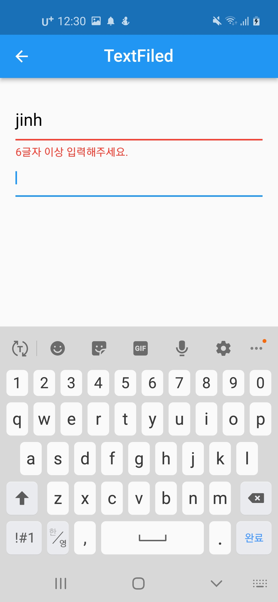
1. TextFormField 선택 안 했을 때(enableBorder)
2. TextFormField 선택 했을 때(focusedBorder, 3, 4번이 2번 Border보다 우선순위 높음)
3. validation error가 발생했을 때(errorBorder)
4. validation error가 발생한 상태에서 unFocus 됐을 때(focusedErrorBorder, 다른 TextFormField를 선택했을 때)
위 4가지만 border만 설정해줘도 대부분의 상황에 적절하게 UI를 구성할 수 있습니다.
InputBorder로는 UnderlineInputBorder와 OutlineInputBorder가 있습니다.
UnderlineInputBorder는 밑줄만 있고, OutlineInputBorder는 사각형 모양의 Border입니다(round가능).
border 하단에 error 메세지를 띄우기 위해서는 errorText 특성에 값을 입력해야합니다. errorText에 null을 입력하면 errorText가 안나오고, String 값을 입력하면 입력한 errorText가 노출됩니다.
예제에서는 onChanged함수를 이용해서 글자 변경이 있을 때마다 setState를 호출해줬습니다.
그리고 TextEditingController를 이용해서 글자수를 체크해주고, errorText에 넣어줄 값을 결정하고 있습니다.
checkErrorText() 함수를 보면 글자수가 0일때와 6글자 이상인 경우에는 null, 그렇지 않은 경우에는 errorText를 return하고 있습니다.
cursorHeight, cursorColor, cursorWidth 특성들은 TextFormField를 선택했을 때 보이는 커서의 모양을 설정해줍니다.
완료 이미지
좌상단부터
enableBorder, focusedErrorBorder,
errorBorder,enableBorder


Full code
import 'package:flutter/material.dart';

class TextFieldScreen extends StatefulWidget {
  const TextFieldScreen({Key? key}) : super(key: key);

  @override
  State<TextFieldScreen> createState() => _TextFieldScreenState();
}

class _TextFieldScreenState extends State<TextFieldScreen> {
  final TextEditingController _editingController = TextEditingController();

  final int idLength = 6;

  @override
  void dispose() {
    _editingController.dispose();
    super.dispose();
  }

  @override
  Widget build(BuildContext context) {
    return Scaffold(
      appBar: customAppBar(title: "TextFiled"),
      body: Padding(
        padding: const EdgeInsets.symmetric(horizontal: 20, vertical: 30),
        child: Column(
          children: [
            _body(),
            TextFormField(),
          ],
        ),
      ),
    );
  }

  Widget _body() {
    return TextFormField(
      controller: _editingController,
      style: const TextStyle(fontSize: 20, color: Colors.black),
      cursorHeight: 24,
      cursorColor: Colors.pink,
      cursorWidth: 3,
      decoration: InputDecoration(
        hintText: "아이디를 입력하세요",
        hintMaxLines: 1,
        hintStyle: const TextStyle(fontSize: 20, color: Colors.grey),
        enabledBorder: _customBorder(2, Colors.blue),
        focusedBorder: _customBorder(2, Colors.green),
        errorBorder: _customBorder(2, Colors.red),
        focusedErrorBorder: _customBorder(4, Colors.red),
        errorText: checkErrorText(),
        errorStyle: const TextStyle(color: Colors.red, fontSize: 13),
        errorMaxLines: 1,
      ),
      autovalidateMode: AutovalidateMode.always,
      onFieldSubmitted: (value) {
        debugPrint('onFieldSubmitted $value ');
      },
      onChanged: (value) {
        setState(() {});
        debugPrint('change $value');
      },
      validator: (value) {
        debugPrint('validator $value');
      },
    );
  }

  String? checkErrorText() {
    if (_editingController.text.isEmpty) return null;
    return _editingController.text.length >= idLength ? null : "6글자 이상 입력해주세요.";
  }

  InputBorder _customBorder(double width, Color color) {
    // return OutlineInputBorder(
    //   borderRadius: const BorderRadius.all(Radius.circular(4)),
    //   borderSide: BorderSide(
    //     width: width,
    //     color: color,
    //   ),
    // );
    return UnderlineInputBorder(
      borderSide: BorderSide(
        width: width,
        color: color,
      ),
    );
  }
}
'Flutter > Flutter widget' 카테고리의 다른 글
| [Flutter] AppBar 사용법 (0) | 2023.03.17 |
|---|---|
| [Flutter] Container widget 사용법 (0) | 2023.03.15 |
| [Flutter] 기본 Dialog 사용법 (0) | 2023.03.14 |
| [Flutter] ListTile Widget 사용법 (0) | 2023.03.11 |
| [Flutter] Checkbox Widget 사용법 (0) | 2023.03.11 |


